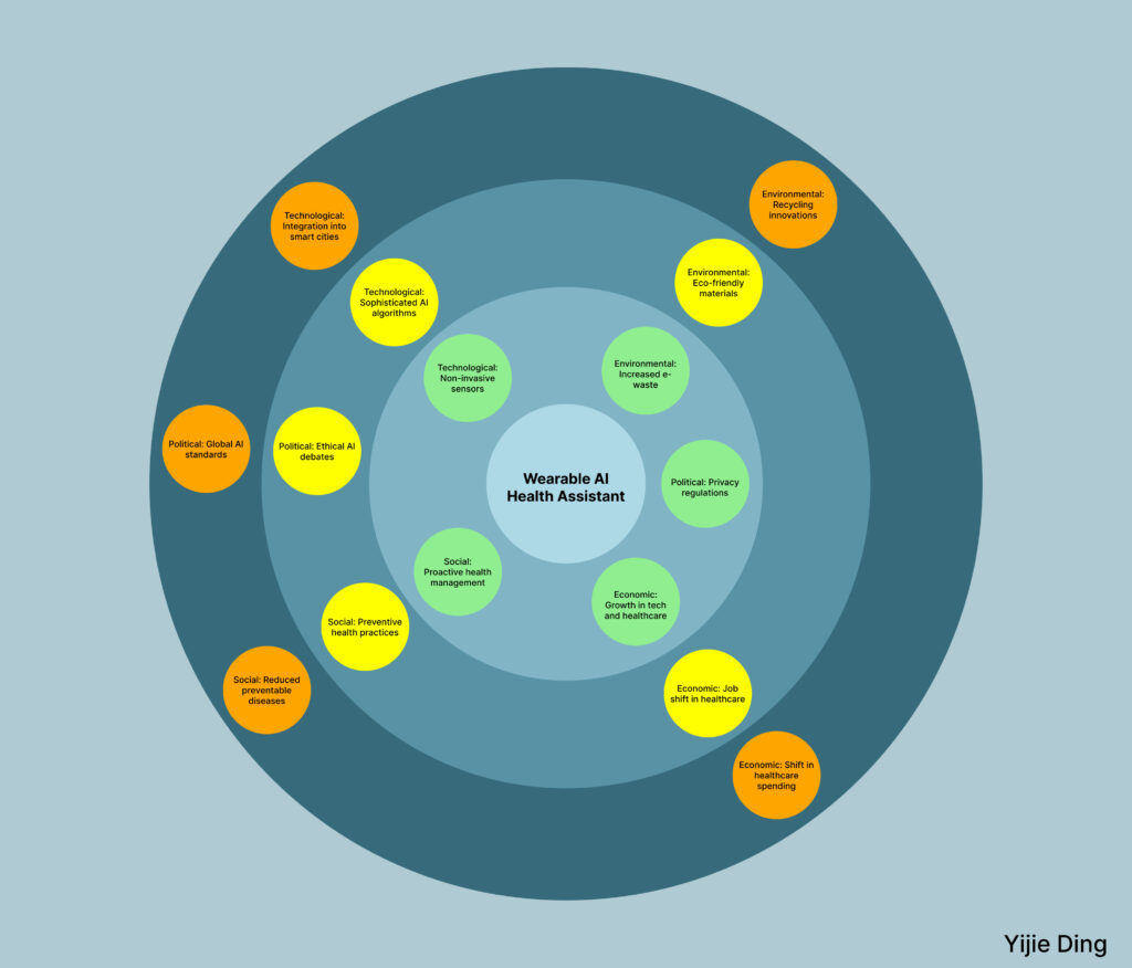
We, as interaction designers hold a responsibility to create systems that prioritize the needs and values of the people using them, especially when integrating AI. Transparency is critical. Users should understand how the system works, what data is being collected, and the limitations of AI so they can make informed decisions. Designers must actively address biases, questioning assumptions in data and algorithms to ensure their work is fair, inclusive, and does not reinforce stereotypes or inequities. Privacy and security need to be central, with clear and accessible controls that put users in charge of their own data. At the same time, design should preserve human agency by empowering users to make their own decisions rather than passively relying on AI. Designers also have to think beyond immediate goals and consider the long-term impact of their work, from how users engage with it daily to its broader societal and environmental effects. Ultimately, it is about balancing innovation with accountability, creating systems that are not only functional but also ethical and meaningful in the context of real human lives.
Ethics
The usage of AI is great in improving productivity, however when asked to help build systems – it takes a very generalist sort of approach.
Although it sounds safe – the problem with taking them live is certain demographics have very different natural tendencies – which if applied wrong it could have massive negative impact on lives of people (classic facebook back in 2013)
Interaction Designers however can use AI to heighten their ethical responsibilities – by giving it prompts to check the work they are taking live and its implicated effects. This way they can use AI systems to recommend ethical routes to take instead – while still helping their companies make profit.
Our responsibility as Interaction designers
As interaction designers, we have an ethical responsibility to ensure the technologies we create are not just functional but also serve the greater good of the people who use them. With AI becoming increasingly integrated into our designs, this responsibility grows even more critical. AI-powered systems can offer incredible benefits, but they can also amplify biases, compromise privacy, and erode trust if not designed with care. Our job isn’t just to make interfaces attractive or efficient—it’s to build systems that respect users’ autonomy, protect their data, and foster transparency in how decisions are made by AI. For instance, we need to think critically about how algorithms might unintentionally favor certain groups over others and take steps to prevent harm.
Another key responsibility is ensuring that users truly understand the AI systems they’re interacting with. Misleading designs—like chatbots that appear human or AI-powered decisions that lack clear explanations—can confuse users and reduce accountability. We must advocate for clarity, providing users with the tools and information they need to make informed decisions. This includes building in explainability for AI systems and designing safeguards that empower users to challenge or opt out of automated decisions when necessary. At the heart of ethical interaction design is empathy: creating with the end user’s well-being, dignity, and humanity in mind. By doing so, we not only create better products but also contribute to a healthier, more equitable society.
Computer History Museum Post-Question
I find it super interesting how quickly AI has so seamlessly integrated itself into our daily lives. When it first became mainstream, I remember how people were shocked by how it was essentially uprooting their lives in so many beneficial ways, with prompts such as creating an optimized schedule for themselves given their necessary tasks for the day or building a recipe with the current ingredients in their house. Very harmless at first, but then transitioning into much more dramatic and system-altering.
In the next decade, we’ll see a shift in jobs and job responsibilities. A lot of lives we be automated and more streamlined than we have now; AI will be present in everything we do. I can’t say exactly how our lives might look in the next 10 years without being biased by how media has portrayed the future, but I can say that parts of our lives will be made much easier and others a lot harder.
A Designer’s Responsibility
As designers, we are the voice of users–of the people. Companies often push for what is beneficial for the business/investors and often forget that there are actually people who will be using their product or service. We have seen it time and time again the backlash that companies face when selfish decisions are made: unhappy users and a loss of loyalty. One of the most recent examples this year is Adobe regarding their push for AI in their tools and their cancellation system, which they are now facing legal trouble for. The rise of AI only pushes us to uphold our morality and integrity as we navigate its growing influence in our daily lives.
There are social and ethical implications that we must consider as designers. While some decisions may be out of our control, it is important that our voice is still heard among the $$$ *money sounds*. Human connection is essential, and when that is lost, purpose and value is reduced to monetary terms. Everything that we create makes ripples in the system, making it important as ever that our considerations are guided with a commitment for the greater good.
How Grocery Delivery Drones Could Change the Future
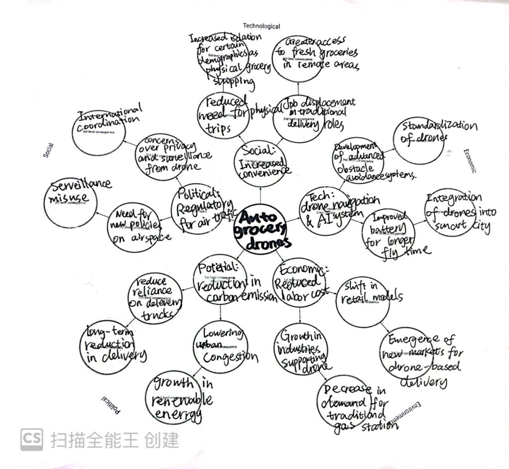
Autonomous grocery delivery drones are a future idea to make life easier. They use drones to deliver groceries instead of trucks or bikes. This can save time, reduce traffic, and lower pollution. It also helps people in remote areas get fresh food. However, there might be problems, like fewer jobs for delivery workers and concerns about privacy. I think it’s interesting to see how this idea could change our daily lives and the world around us.
Futures Wheel
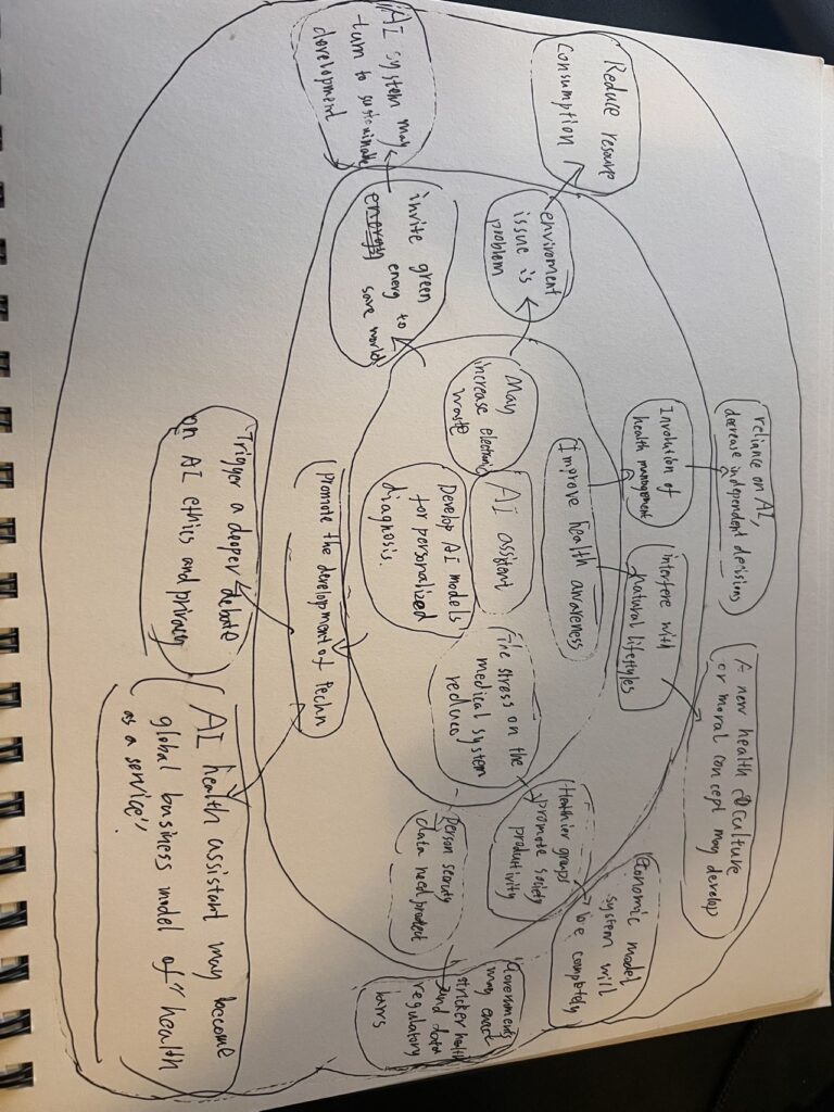
By mapping out this wheel of the future, we can gain a comprehensive understanding of the potential impact of AI assistants, thereby assessing the ethical, social, and environmental feasibility of products or services in advance and providing a basis for more responsible innovation decisions.
Ethics
Interaction designers have a profound ethical responsibility to prioritize the well-being, autonomy, and trust of their end users, especially when integrating AI into their work. They must design systems that are transparent, ensuring users understand how AI operates and what role it plays in their interactions. Protecting user privacy is paramount, requiring robust mechanisms to secure data and provide clear options for user control. Designers must actively work to prevent bias, creating inclusive experiences that do not discriminate or perpetuate harmful stereotypes. It is equally crucial to empower users, giving them the ability to manage, override, or opt out of AI-driven decisions, and to anticipate potential harm by considering the broader consequences of AI deployment. Automation should be thoughtfully integrated to enhance human capabilities without undermining agency or accountability. Additionally, designers must ensure accessibility for users of all abilities and foster trust through consistent, reliable, and user-friendly systems. Ethical design requires collaboration with interdisciplinary teams, including ethicists and user advocates, to evaluate the societal impact of AI and ensure its alignment with human values. By embracing these principles, interaction designers can create AI systems that are not only innovative but also equitable and responsible.
iPod/iPhone Technology
Technology changed from something we used occasionally to something we live with every day. It stopped feeling like just a tool and started becoming a personal part of our lives. Music wasn’t tied to a stereo anymore—it traveled with you, shaping your mood wherever you went. Then came devices that connected you to everything—people, ideas, entertainment—all in the palm of your hand. Technology didn’t just help us get things done; it became how we experienced the world.
For interaction design, this meant a major shift. Designers had to think beyond function and start focusing on how technology feels. Is it intuitive? Does it fit naturally into someone’s day? It’s not just about solving problems anymore—it’s about creating experiences that are seamless, meaningful, and human.
Pace Layers & IXD
In IXD, Pace Layers shape how work evolves by highlighting what stays constant and what changes quickly. Stable layers like human behavior and cultural norms are lasting principles that as makes interfaces intuitive, accessible, and universally clear. These elements remain the foundation of good design, providing timeless solutions that resonates within various contexts. Middle layers shift more gradually, prompting designers to adapt systems and experiences to new platforms, ensuring that designs remain functional and relevant over time. The fastest layers are like visual trends, they require frequent iterations to keep up with user expectations. For example: Integrating AI and emerging tools within existing systems. Such as how Google incorporated AI search engines within user searches. Balancing these layers allow designers to create work that is adaptable and evolves alongside the evolving tech world.
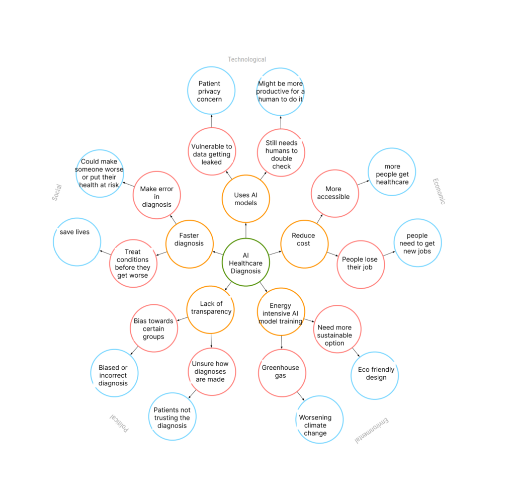
Futures Wheel AI Healthcare diagnosis
I was thinking about AI in the future that diagnoses people’s health.
Ethics
Interaction designers have a crucial ethical responsibility to create transparent, user-centered interfaces that respect privacy and promote inclusivity. When integrating AI, designers must ensure that users clearly understand when they are interacting with AI-driven systems. Transparency about data collection, how algorithms work, and providing clear consent options help build trust and reduce the risk of manipulation through dark patterns or misleading interfaces. Designers must also prioritize accessibility, making products usable for people with diverse abilities and backgrounds.
Another essential responsibility is addressing fairness and bias. AI systems are only as good as the data they are trained on. Interaction designers must work with data scientists to ensure diverse and representative data sets, avoiding discriminatory outcomes in critical applications such as hiring platforms, financial tools, and recommendation engines. Creating fair and inclusive experiences means constantly auditing AI outputs and implementing corrections when biases are detected.
Lastly, accountability and sustainability are central to ethical design. Designers must accept responsibility for unintended consequences by offering feedback systems and avenues for user support. They should also consider the environmental impact of digital products by designing energy-efficient, low-resource-consuming systems. By adhering to these principles, interaction designers can craft AI-powered experiences that are not only functional but also ethical, equitable, and sustainable.
Ethical responsibilities of IXD
Interaction designers can be ethical by avoiding dark patterns in design. Dark patterns are when a design tricks users into doing things they might not have meant to do. Manipulative wording of text, manipulating visual emphasis, and creating a false sense of urgency can cause users to make hasty or bad choices on accident. When it comes to AI, interaction designers must make sure to anticipate the AI having biases due to the information it was trained on. We can also try to make the AI less biased. AI algorithms are also often used to give the user more content that they’ll like and make them addicted. It’s important to be aware of the effects that a design could have on a user, positive and negative. Overall, interfaces should be transparent and clear, making the user experience a positive one and having a positive effect on users.
Ada Lovelace and Lillian Gilbreth: Pioneers in Interaction Design History
As an interaction design student, I’ve realized how much our field owes to the work of early innovators like Ada Lovelace and Lillian Gilbreth. Even though they lived in completely different times and worked in different fields, both women laid the foundation for how we think about systems, efficiency, and human-computer interaction today.
Ada Lovelace is often called the first computer programmer. In the 1840s, she worked with Charles Babbage on his Analytical Engine, a mechanical computer. What makes her so important is that she didn’t just see the machine as something that could calculate numbers—she imagined it could create art, like music, by following instructions. This early vision of computation as more than math feels like the root of modern interaction design. Her work reminds us to think beyond the technical and consider the creative possibilities of technology.
Lillian Gilbreth, on the other hand, was a pioneer in industrial engineering and ergonomics. In the early 20th century, she studied how people interact with tools and systems, using motion studies to improve efficiency and reduce fatigue. Her focus on designing workflows to fit human needs connects directly to what we do as interaction designers. When we create user-centered interfaces or improve accessibility, we’re following her example of putting people first.
These women remind us that interaction design is not just about technology—it’s about understanding people and imagining new ways to improve their lives. Knowing their stories gives me a deeper appreciation for the history of our field and the responsibility we have to carry their legacy forward.
The Ethical Responsibilities of Interaction Designers in the Age of AI
As an interaction design student, I often think about the role we play in shaping the digital world. Our work isn’t just about making interfaces easy to use or aesthetically pleasing; it’s about creating experiences that respect and empower people. When AI comes into the picture, this responsibility grows even bigger.
AI can be incredibly powerful. It helps automate tasks, makes predictions, and personalizes experiences. But it also raises questions. Are we protecting user data? Are we avoiding bias in AI algorithms? Are we designing systems that explain themselves clearly? These are just a few of the ethical challenges we face.
For example, think about a chatbot powered by AI. If it doesn’t tell the user it’s a bot, is that misleading? Or imagine an AI-powered recommendation system that only suggests products based on profit margins. Does that respect the user’s best interests? These small decisions can have big consequences.
As designers, our ethical responsibilities include:
- Transparency: Users should understand how AI is making decisions. For instance, if an algorithm recommends a product, users deserve to know why.
- Privacy: Collecting data is necessary for AI, but we must minimize it and make sure it’s stored securely. People trust us with their personal information, and we shouldn’t take that lightly.
- Fairness: AI can reflect biases in the data it’s trained on. It’s our job to spot these biases and advocate for systems that treat all users equally.
- Empathy: Our work should help, not harm. This means designing for accessibility, considering edge cases, and avoiding manipulative practices.
AI is a tool. Like any tool, it’s neutral until we decide how to use it. Our decisions as interaction designers give AI meaning. So, while the future of technology is exciting, it’s also a reminder: the ethical choices we make today will shape the experiences of millions tomorrow.
Future Wheel-Auto Drive
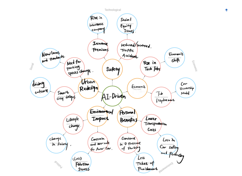
In my perspective, I think auto driving is a technique that has huge potential impact. I explored the potential impacts of widespread adoption of auto-drive technology, and do the research about zoox and waymo, and the public voice.
We Should Think Of Ethics
Today is the day of AI, and in the age of AI, IX Designers have significant responsibilities about ethic, especially to the digital products, A critical aspect is to ensure privacy and datas security while doing the data collections. Imply the safeguards issue, and how and what should we do to obtaining informed consents from users. We as a designers must also see the algorithmic bias to create fair interfaces which prevent potential discriminations. So the explainability of AI resources systems are quite essential, which users able to understand decision making and avoiding “ black box” system. Thus, we can trust AI in a way.
More than that, as a designer, we should prioritize use environment, AI should consider mental health of human beings because it do not have emotions at all. Then, the issue of digital using habits can be promoting healthily. To balance the ethic use of persuasive techniques can engage users, reduce the unnecessary features, and minimizing energy consumption can decrease environmental impact from AI power technologies. Set up principles to form a system that is innovative and social beneficial.
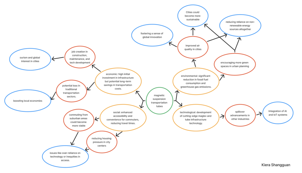
Magnetic Suspension Transportation Tubes
Concept: A city-wide transportation system using magnetic suspension (maglev) tubes that allow pods to zip through seamlessly without wheels. The idea is to revolutionize urban transportation by making it faster, cleaner, and more efficient while addressing challenges like traffic congestion and emissions.
Background:Inspired by the traffic tubes in Zootopia(movie) and maglev train in Shanghai, this system uses magnetic levitation to eliminate the need for traditional wheels and engines. It could drastically reduce the carbon footprint of urban commuting, offering an eco-friendly alternative to cars and buses. At the same time, its implementation would reshape urban infrastructure and lifestyle.

https://www.reddit.com/r/zootopia/comments/77cbaw/this_tube_in_particular_doesnt_actually_appear_to/

https://dewesoft.com/blog/testing-worlds-fastest-train
Good design, bad consequences?
As an interaction designer, I’ve been thinking a lot about our ethical responsibilities, especially when it comes to how social media apps like Instagram or TikTok are designed. Let’s be real—these platforms are engineered to keep us scrolling for hours. Infinite scroll, autoplay, endless notifications—these aren’t just random features. They’re intentional designs meant to hook us, sometimes at the expense of our mental well-being.
This all came into sharper focus for me when I read about a teenager who couldn’t handle being without his phone. His parents locked it in a cabinet during dinner, and instead of enjoying family time, he became so anxious that he broke the cabinet open with a knife to get his phone back. That story hit me hard. It made me realize how much our designs, no matter how clever or successful, can sometimes harm people.
So, what does that mean for us as designers? Well, first off, we need to ask ourselves: are we helping people or just exploiting their attention? Sure, keeping users engaged might feel like a win, but at what cost? People deserve tools that empower them, not designs that manipulate them into spending hours in a digital rabbit hole.
I think our role should be about promoting digital well-being. This could mean creating features that remind users to take breaks, helping them set limits on their screen time, or even just being transparent about how algorithms work. For example, instead of hiding behind “recommended for you,” why not explain why the algorithm is suggesting something? That kind of honesty can build trust and put the user back in control.
Another thing we have to think about is the broader impact of addiction. That teenager at the dinner table is just one example, but it’s a reality for so many people. Our designs shouldn’t be making people anxious or pulling them away from their relationships. Instead, they should encourage healthier interactions—not just with the app, but with the world around them.
Of course, there’s always pressure to meet business goals. More engagement equals more revenue, right? But as designers, we need to push back against practices that harm users. It’s not easy, but I think we have the responsibility to advocate for solutions that strike a balance—helping the business while also protecting the people who use our designs.
In the end, designing for ethics isn’t just about following some checklist. It’s about having empathy and thinking critically about the long-term consequences of what we create. Technology is such a big part of life now, and as designers, we’re shaping how people interact with it. That’s a huge responsibility—and one we need to take seriously.
